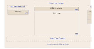
I've recently decided to make the switch from MS Internet Explorer to Mozilla Firefox, and have noticed problems when viewing the layouts screen (in Blogger dashboard) of my three column templates.
Unlike in IE, where the frame adjusts to match the width of the template, in Firefox, the right sidebars seem "cut off".
src="http://pagead2.googlesyndication.com/pagead/show_ads.js">
Luckily, the sidebar (and occasionally, other elements) are not cut off in the layouts view. In order to see and edit these elements, you need to scroll down to the bottom of the page and slide the scroller in the frame to the right. You'll then see the full span of your blog, and will be able to edit your right hand sidebar elements.
However, I have found a solution which allows you to see your blog elements laid out in good view from this:
To this:
To do this, you will need to edit the "body#layout" section in your blog template (this is found just before the closing </b:skin> tag). This section of your stylesheet affect how your layout looks in the layout editor of your Blogger dashboard. By default, this will be defined something like this:
/** Page structure tweaks for layout editor wireframe */In order to make your blog appear differently in the layouts section, you will need to define how you would like your elements to be displayed. This can be different from the actual dimensions of your blog elements, as it will not affect the actual layout of your blog! Here is an example of how you can define the layout properties:
body#layout #main-wrap,
body#layout #sidebar-wrap,
body#layout #header-wrapper {
margin-top: 0;
}
/** Page structure tweaks for layout editor wireframe */
body#layout #outer-wrapper {
width: 770px;
margin-left: auto;
margin-right: auto;
}
body#layout #header-wrapper {
margin-left: 0px;
margin-right: 0px;
width: 600px;
height: 279px;
}
body#layout #main-wrapper {
width: 400px;
padding: 30px 0 0 0;
}
body#layout #sidebar-wrapper {
width: 150px;
padding: 0 0 5px 0;
}
body#layout #left-sidebar-wrapper {
width: 150px;
margin-right: 5px;
padding: 0 0 5px 0;
}
body#layout #footer {
width:600px;
margin:0 auto;
padding-top:15px;
}
You could use these dimensions as the basis for editing the layout of your wireframe, just be sure that the sections referred to all match the names of those defined in your blog (eg: "main-wrapper" may be called "main-wrap-1" in your blog).
I hope this helps resolve any problems you may have had in using 3 column Blogger templates!
Technorati Tags: firefox | blogger | layouts | problems | layout | editor | wireframe |


3 comments:
I can't find this code in the template anymore. Any thoughts on how to fix it now?
Thanks!
- Cesia.
I tested this out, thanks a lot for this. But there is still a problem, the hight of outer wrapper is sort of fixed. If I add a lot content in the sidebar wrapper, the sidebar goes out of the bottom and press the footer widget out of the bottom and make it invisible and not available.
And one negative thing is that when you do some shanges you have to take care of the coding here as well.
Comment: strange thing this, I have been working a lot with my template and sometimes the shallenge have been to get it work on IE 6. But about the element area problem..everyting work just perfect on IE, but not on Firefox or Safari? :-)
I was wondering, is there something wrong with my template seeing as the expandable post hack that I'm using can't be seen in Firefox? But works perfectly in IE. :/
Post a Comment