
Showing posts with label Customize your Blogger Template. Show all posts
Showing posts with label Customize your Blogger Template. Show all posts
21
Related Posts with Thumbnails for Blogger - New Version by BloggerWidgets
Friday, September 25, 2009 /
Filed Under:
Customize your Blogger Template
Aneesh of Blogger Widgets has developed a new "Related Posts" script for Blogger which displays thumbnails of images in addition to linked post titles:

In appearance, this Blogger "add-on" is similar to the LinkWithin script. Each section is highlighted in a complementary colour when the mouse hovers over it, and the entire section is clickable, leading to the URL of the "related post" displayed.
27
How to add Blogger's Read More function to customized templates
Friday, September 11, 2009 /
Filed Under:
Customize your Blogger Template

As announced yesterday, Blogger have now enabled selective post summaries for our blogs. This means we can add a "jump break" in our posts, after which any content will only be visible on item pages.
Those of us using customized templates will probably need to add the code required for this function to work. In this article, I'll explain how easy this is to implement, as well as some helpful hints for customizing the "Read More" link.
25
A Popular Posts Gadget from Google Friend Connect
Saturday, August 29, 2009 /
Filed Under:
Customize your Blogger Template
Gadgets

This is a feature which I'm sure we've all been waiting for! While we have seen various implementations of popular posts gadgets in the past, I've found these are not as useful or easy to configure as I'd prefer.
In contrast, the Friend Connect Recommended Gadget stable, reliable and quickly updates. Being developed and hosted by Google ensures this is unlikely to suffer issues, and once installed it's very easy for your blog readers to recommend their favourite posts.
Want to see how it works? Take a look in the sidebar to see a list of posts recommended by Blogger Buster readers, and scroll down to the bottom of this post for the button you can use to vote (this appears on every page of Blogger Buster, so feel free to recommend any other posts you may like!).
Those of you reading this in a feed reader may like to pop over to the site to see this gadget in action.
How to install your Friend Connect Popular Posts Gadget
Unfortunately, this Friend Connect gadget is not (yet) installable in one click. There are two elements required for complete installation, and these are relatively easy.Firstly, log into Friend Connect. You will need to use the same credentials (username and password) as you do when logging in to Blogger.
Once you've logged in, you'll see a page which appears similar to this one:

Any blogs which you have created with your Google account will appear in the list on the left-hand side of the page.
Click on the blog you would like to work with (if this is not already selected). This will open a sub-menu beneath the title of your blog.
Click the "Social Gadgets" link in this sub-menu:

On the following page, scroll down to the "Recommendation" widget - this is the gadget we will be using to display our blog's most popular posts, as voted by blog members:

Click through to create and style the Recommendation gadget for your blog.
Style the Recommendation List
In the first area of this page, you can choose how your recommendation list will be styled when added to your Blogger layout.
If you'd prefer any of the color elements (such as the background and border) to be transparent, simply delete the hex value.
You'll be able to preview the changes made to the style and settings of your recommendation list in the top right corner of the page.
Configure the Voting Buttons
The second area of this page enables you to configure the appearance of the voting button. This is what will appear on the post pages of your blog, and is what your readers will click to recommend posts they enjoy.There are two distinct types of voting buttons you could choose from:
| A "compact" button appears like this |  |
| A "modular" button appears like this: |  |

Generate and add the JavaScript for your Gadget
Once you've configured the appearance you prefer for the recommendation list and voting button, you can generate the codes required to add these to your template by clicking the button in the third section of the page:
Add the code for the Recommendation List
The easiest way to include the Recommendation List (the list of your most popular posts) in your blog is to paste the code into an HTML/JavaScript widget in your Blogger sidebar.Simply highlight all of the code in the "aggregation gadget" section, and copy to your clipboard. Then go to Layout>Page Elements in your Blogger dashboard, create a new HTML/JavaScript widget in the area of your choice and paste the code from your clipboard into the content section of your gadget.
Add the code for your voting button on post pages
Ideally, we should add the voting button to appear only on item pages. This ensures there is no conflict when posting multiple buttons on the same page (for example, the blog home page which displays more than one post); it also makes for simpler installation.To add the voting button to our item pages, we need to edit our Blogger template code.
Go to Layout>Edit HTML in your Blogger dashboard, and ensure you have checked the "Expand widget templates" box.
Then using your browser's search function, locate the line which contains
<data:post.body/>This section of code may be wrapped in <div> or <p> tags depending on the template you are using.
Immediately after this line, paste the following section of code:
<b:if cond = 'data:blog.pageType == "item"'>
<!-- Here is where to paste the JavaScript for the button -->
</b:if>
<b:if cond...> and </b:if> tags which we previously added in the template code.Here is how the completed installation should appear:
<b:if cond = 'data:blog.pageType == "item"'> <!-- Include the Google Friend Connect javascript library. -->
<script type="text/javascript" src="http://www.google.com/friendconnect/script/friendconnect.js"></script>
<!-- Define the div tag where the gadget will be inserted. -->
<div id="div-1020104213976883876" style="width:100%;"></div>
<!-- Render the gadget into a div. -->
<script type="text/javascript">
var skin = {};
skin['HEIGHT'] = '21';
skin['BUTTON_STYLE'] = 'compact';
skin['BUTTON_TEXT'] = 'Recommend it!';
skin['BUTTON_ICON'] = 'heart';
google.friendconnect.container.setParentUrl('/' /* location of rpc_relay.html and canvas.html */);
google.friendconnect.container.renderOpenSocialGadget(
{ id: 'div-1020104213976883876',
url:'http://www.google.com/friendconnect/gadgets/recommended_pages.xml',
height: 21,
site: '06135972569882299778',
'view-params':{"pageUrl":location.href,"pageTitle":(document.title ? document.title : location.href),"docId":"recommendedPages"}
},
skin);
</script>
</b:if>Using your Recommendation Gadget
At first, your recommendation list will not display any posts. This is because no posts have yet been voted for using the voting button.You could vote for a few posts yourself by clicking on the voting button on post pages, or you could simply wait for readers to vote by themselves.
When using the voting link, a pop-up page will appear prompting the user to log into Friend Connect (if they are not already logged in) and afterwards will be able to recommend the post. Votes are counted almost immediately, and are listed beneath each item in the Recommendation List:

What do you think?
I sincerely prefer the Friend Connect Recommendation Gadget to other "popular posts" widgets I have tried as the results are based on reder engagement and genuine recommendations which offer a greater sense of community than "page views" alone.My only reservation is that this gadget cannot be added in a few simple clicks. Having to edit our Blogger templates to add the voting buttons id a dissuading factor for many when considering whether or not to install it.
That said, I have a good feeling that this gadget may soon be integrated into the Blogger system, as so many Friend Connect gadgets and features already have!
What do you think of the Friend Connect Recommendation gadget? Is installation too complex, or are you happy to use this gadget for readers to recommend their favourite posts?
Please let us know your opinions by leaving your comments below.
Image credit: RichKidsUnite, via Flickr Creative Commons
49
Related Posts with Thumbnails using LinkWithin
Thursday, July 23, 2009 /
Filed Under:
Customize your Blogger Template
Resources

I've written about several different methods which Blogger users can choose to display related posts - all of which perform their function well enough. But after seeing several of my favourite sites displaying links to related items with thumbnails using LinkWithin's free service, I was intrigued to discover how well this may be adapted for use with Blogger.
About LinkWithin
LinkWithin is a free service offered by a small team based in New York. This free service enables us to display related posts with thumbnails below our blog posts (the thumbnail is taken from an image within the post it links to).We retrieve and index all stories from your blog archive, not just recent stories, making them accessible to new or casual readers of your blog who would not otherwise encounter them.The posts chosen to appear as related posts are based on several factors including:
- Relevance
- Popularity
- Recency
We plan to introduce revenue-sharing features in the future, but they will be optional.At present, there is little documentation for us to be certain of these factors, though after testing LinkWithin in a few different sites, I'm pretty impressed by the choices generated for each post!
Here is an example of how LinkWithin functions for WeLoveBlogger.com:

Why LinkWithin may be a more ideal solution than other related posts solutions for Blogger
The "related posts" solutions for Blogger which I've used until now have all relied on label feeds. That is, the recent posts generated by such scripts collect recent posts from the same label (category). This often means that posts deeper within our archives are generally ignored, even when they may be far more relevant than the more recent posts displayed.LinkWithin parses all posts from our blogs, and chooses the posts to be displayed using more complex and relevant factors. This ensures far greater relevancy which is better for our readers and also ensures that older posts are included in the display.
How to add LinkWithin Related Posts to Your Blogger Blog
If you're using a standard, uncustomized Blogger template, the method for installing LinkWithin is fairly straightforward. Simply visit the LinkWithin website, fill in the form on the right-hand side (choosing Blogger as your platform) and follow the instructions provided.This will install the related posts in your template as a gadget beneath the main posts section, though you'll find the "You may like these related stories" section will be displayed beneath each of your blog posts (before the post-footer section). It will also display on each and every page of your blog, including the main, archive and search pages.
Custom Installation of LinkWithin for Blogger templates
If you prefer to display your related posts only on item pages or have a customized, non-standard Blogger template, here is how you can install LinkWithin:- Visit the LinkWithin website and fill in the form on the right-hand side. For the "platform" be sure to choose "Other":

- On the next page, you will find a script like this is generated. From this code, you need to write down your unique "site ID" for later use (or copy this to your favourite text editor):
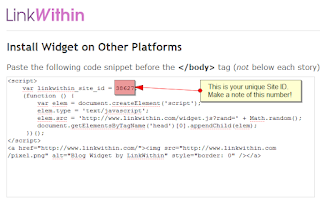
- Once you have a note of your Site ID, go to Layout>Edit HTML in your Blogger dashboard and ensure you have checked the "Expand widget templates" box.
- Using your browser's search function, locate this tag (or similar) in your Blogger template code: <div class='post-footer'>
Depending on the template you are using, this tag may vary slightly though you should usually be able to locate 'post-footer' in your template code. - Immediately before this line, paste the following section of code, replacing "YOUR_SITE_ID" with the ID number you have noted down for your site:
<b:if cond='data:blog.pageType == "item"'>
<script>
var linkwithin_site_id = YOUR_SITE_ID;
(function () {
var elem = document.createElement('script');
elem.type = 'text/javascript';
elem.src = 'http://www.linkwithin.com/widget.js?rand=' + Math.random();
document.getElementsByTagName('head')[0].appendChild(elem);
})();
</script>
<a href="http://www.linkwithin.com/"><img src="http://www.linkwithin.com/pixel.png" alt="Blog Widget by LinkWithin" style="border: 0" /></a>
</b:if> - Preview the changes you have made before saving your template. The LinkWithin gadget should not display in the preview; furthermore, if there are any errors in the installation you will be able to see before attempting to save.
- If all is well, save your template and visit an item page in your blog: you should be able to see related posts showing up beneath your blog posts.


Support for LinkWithin's related posts
While I can help with installation for LinkWithin in Blogger templates, I'm not able to help with specific problems with the script.Luckily, the LinkWithin team offer a good support service via email:
If your blog uses a non-standard custom template/theme, we will need to add support for your blog manually, and we can do this only if the widget remains installed on your blog. Please email us at support AT linkwithin DOT com, and we will fix the problem, usually within 1-2 days. Thank you for your patience!At the moment, it appears we can only display three related posts. Hopefully LinkWithin will offer the option to display more (or less) items in a future version of the script.
Why I'm not using LinkWithin yet...
LinkWithin is a very useful solution for Blogger users wishing to display links to related posts in their blog. I recommend this service and will be using this in a future release of Blogger Buster.My current template is highly complex and has served me well for many months. However, there are several new (and upcoming) customizations and new features for Blogger which may not work so well in this design. I'll explain more about this in a future post when the site changes are closer to completion.
Are you using LinkWithin? What do you think about this service?
If you're already using LinkWithin (or plan to use this soon), please let us know your opinions of this free service, and how well you think this adapts to displaying posts in your blog by leaving your comments below.
54
Blogger Read More/Post Summaries - The Best News Yet!
Tuesday, June 9, 2009 /
Filed Under:
Blogger News and Issues
Customize your Blogger Template
One of the functions most voted for in Blogger's recent Product Ideas forum was the ability to summarize blog posts on non-item pages.
I've written about a few different approaches to this, but these methods were never so easy to implement.
Luckily I came across this tutorial from Quite Random which offers the simplest - and most useful - method of displaying post summaries automatically for our Blogger posts, complete with a thumbnail from images used in our posts.
This customization is very easy to implement (there are literally only two steps) with very little editing of the template required. I installed with immediate success on several templates to test it out, and with only a little tweaking on one of my most customized designs.
In short, this is a fabulous implementation of post summaries for Blogger. Be sure to pop over to Quite Random to check out this post and learn how to install this hack for your own Blogger blogs.
However... This is not my only source of good news regarding post summaries for Blogger!
The Blogger team are in the process of implementing this function in Blogger! Or at least, I'm pretty certain they are.
Take a look at this screenshot which was taken from a clean installation of Minima (a default Blogger template) on a new blog (click the image for a larger version):
 These tags look suspiciously like tags which could be used for implementation of post summaries. What's more, it seems we can choose whether or not to summarize our posts, and also the text used for the link to read the full article.
I can't say for sure when this implementation will become available, though I believe this will first be rolled out into Blogger in Draft so any issues can be resolved before the summaries become available to us all.
There's not yet been any mention about this on the Blogger in Draft blog, Blogger Buzz or even by the team on Twitter, but since this code is now appearing in new templates I'd guess this will become available in the very near future.
Stay tuned, I'll get more news about this as it happens and will (of course) explain how to use summaries in customized templates too.
This is a feature I'm very excited to know is in progress, so if anyone does have any news to share, please let me know!
I've written about a few different approaches to this, but these methods were never so easy to implement.
Luckily I came across this tutorial from Quite Random which offers the simplest - and most useful - method of displaying post summaries automatically for our Blogger posts, complete with a thumbnail from images used in our posts.
This customization is very easy to implement (there are literally only two steps) with very little editing of the template required. I installed with immediate success on several templates to test it out, and with only a little tweaking on one of my most customized designs.
In short, this is a fabulous implementation of post summaries for Blogger. Be sure to pop over to Quite Random to check out this post and learn how to install this hack for your own Blogger blogs.
However... This is not my only source of good news regarding post summaries for Blogger!
The Blogger team are in the process of implementing this function in Blogger! Or at least, I'm pretty certain they are.
Take a look at this screenshot which was taken from a clean installation of Minima (a default Blogger template) on a new blog (click the image for a larger version):

I can't say for sure when this implementation will become available, though I believe this will first be rolled out into Blogger in Draft so any issues can be resolved before the summaries become available to us all.
There's not yet been any mention about this on the Blogger in Draft blog, Blogger Buzz or even by the team on Twitter, but since this code is now appearing in new templates I'd guess this will become available in the very near future.
Stay tuned, I'll get more news about this as it happens and will (of course) explain how to use summaries in customized templates too.
This is a feature I'm very excited to know is in progress, so if anyone does have any news to share, please let me know!
39
How to make columns of equal height in Blogger
Tuesday, November 25, 2008 /
Filed Under:
Customize your Blogger Template
An issue of blog design is that CSS based layouts cannot produce columns of equal heights. For example, when designing a two or three column template, it is almost impossible to make the sidebar(s) stretch to the length of the main posts column. This is particularly noticeable when a background color (or image) is used for the sidebar which does not stretch to the length of the page.


This issue is also relevant for those who display their blog posts side-by-side on the home page. Posts which are of equal height would appear in a harmonious grid-like format which is more pleasant to the eyes, whereas posts of unequal length disrupt the grid-like pattern and can often cause disarray in the layout.
In this tutorial, I'll explain how to use JavaScript to ensure columns of your choosing (whether the sidebars and main column, or individual posts) appear at equal heights to ensure a pleasant and harmonious layout for your blog design.
In this tutorial, we will be using an adaptation of the "Matching Columns" JavaScript by Alejandro Gervasio. which was modified to work in FireFox by Stefan Mischook for Killersites.com. You can read the original article and even view a video explaining how this script works over at the Killersites blog.
This JavaScript matches the height of all columns which use a specific CSS "class". It finds the length of the longest columns which uses this class name, then creates extra CSS declarations to ensure all other columns using this class are lengthened to the same height.
For example, if we use the class of "column" for both the main posts section and sidebars in our blog template, the script will ensure that the main column and both sidebars appear of equal length when viewed in a web browser.
The original Matching Columns JavaScripts use external files which are linked to in the head section of the web-page. However, I have adapted this method for use in Blogger templates so we can use "inline" JavaScript, meaning we do not need to host a JavaScript file on an external host.
The first step to creating columns of matching height in your Blogger layout is to add the required JavaScript code to the head section of your template.
This is very simple! All you need to do is copy the following section of code and paste this just before the closing <head> tag in your Blogger template (it is quite long so be sure to copy the entire section of code to your clipboard!):
Once you have pasted this section of code in your template, proceed to save it. If for some reason you have made any errors when pasting the code, you will receive an error message and be unable to save.
Now to make sections of your Blogger layout have equal heights, we need to apply the class of "column" to those sections in the actual template code. I will offer two variations of how this can be achieved in this tutorial: making the sidebar and main-wrapper equal height, and making all posts equal height (for use when making posts appear side-by-side).
This method works best for layouts including at least one colored sidebar (whether this feature a background color or background images for effect). There are many different non-standard templates using this style of layout, so it's likely that the identifiers of the divisions referenced here could be different in your own template.
To make the sidebar(s) and main column of equal length, you will need to add the class of "column" to these divisions in the template.
For the main-wrapper (the section which holds your blog posts) you should look for a line like this in your template:
Add the code highlighted in red to this line:
If you cannot find <div id='main-wrapper'> in your template, this may be called 'main-wrap' or 'main-section' instead. Use your discretion to find the appropriate code tag; you can always change things later!
Next, you need to add the class of column to your sidebar or sidebars. If your template features more than one sidebar, this could become a little complicated though I will do my best to explain!
Most Blogger templates identify the sidebar-wrapper like this:
If you find this in your template code, simply add the section in red:
The main sidebar could also be called 'sidebar-wrap', 'left-sidebar' or even 'left-bar' depending on the template you are working with. Again, use your discretion and add class='column' in the place you think most appropriate for your template.
This also applies in templates where you have a second sidebar. It may be named <div id='sidebar-right'> ; 'right-sidebar-wrapper', 'new-sidebar-wrapper' or something entirely different. Simply add class='column' inside the division tag which you think references the correct section in your template.
Now to check if your modifications have been successful, attempt to preview your template. Since the JavaScript we are using is contained within the template (not referenced from an external host) you should be able to see the difference straight away. This means that your blog sidebar should appear as long as your main posts column.
If all looks well, you can proceed to save your template and enjoy your new matching columns. If your sidebar and main column do not appear at equal heights, clear your edits and begin again being sure to check the placement of the class='column' sections you have added.
This method is particularly useful when using my recently posted customization to display posts side-by-side on non-item pages. Using this method ensures your posts appear in a grid-like fashion with spaces beneath shorter posts so all headings are correctly aligned.
For this example, you will need to ensure you have checked the "Expand widget templates" box on the Edit HTML page, as we will be adding the class of "column" inside the main posts widget.
Firstly, ensure you have added the JavaScript before the closing </head> tag in your Blogger template.
Next, search for the following line of code (or similar):
If you cannot find this line, search for the following instead:
Or any other division tag which begins with <div class='post
You do not need to add the entire class='column' phrase here as this div already has class attributes. Instead, we simply need to add the class identifier, like this:
or alternatively,
This is because divisions can have more than one "class" (though they can only have one "id"!).
Once you have added this extra class to the posts section, preview your template to see that your blog posts are now all of equal height.
You can also adapt this script and methods to add columns of equal height to your blog footer (in conjunction with my three column footer hack, perhaps!), or to any other areas of your blog template which you would like to be of matching heights.
Simply apply the class of "column" to all divisions which you would like to appear at the same height, and ensure you have pasted the JavaScript before the closing </head> tag in your Blogger template!
I hope you have found this tutorial to be a useful addition to the arsenal of Blogger customizations and tutorials posted here on Blogger Buster! Please feel free to leave your comments or let us know how you have used the matching columns script in your own designs by typing your message below.


This issue is also relevant for those who display their blog posts side-by-side on the home page. Posts which are of equal height would appear in a harmonious grid-like format which is more pleasant to the eyes, whereas posts of unequal length disrupt the grid-like pattern and can often cause disarray in the layout.
In this tutorial, I'll explain how to use JavaScript to ensure columns of your choosing (whether the sidebars and main column, or individual posts) appear at equal heights to ensure a pleasant and harmonious layout for your blog design.
The "Matching Columns Script" and how it works
In this tutorial, we will be using an adaptation of the "Matching Columns" JavaScript by Alejandro Gervasio. which was modified to work in FireFox by Stefan Mischook for Killersites.com. You can read the original article and even view a video explaining how this script works over at the Killersites blog.
This JavaScript matches the height of all columns which use a specific CSS "class". It finds the length of the longest columns which uses this class name, then creates extra CSS declarations to ensure all other columns using this class are lengthened to the same height.
For example, if we use the class of "column" for both the main posts section and sidebars in our blog template, the script will ensure that the main column and both sidebars appear of equal length when viewed in a web browser.
The original Matching Columns JavaScripts use external files which are linked to in the head section of the web-page. However, I have adapted this method for use in Blogger templates so we can use "inline" JavaScript, meaning we do not need to host a JavaScript file on an external host.
How to add the Matching Columns function to your Blogger layout
The first step to creating columns of matching height in your Blogger layout is to add the required JavaScript code to the head section of your template.
This is very simple! All you need to do is copy the following section of code and paste this just before the closing <head> tag in your Blogger template (it is quite long so be sure to copy the entire section of code to your clipboard!):
<!-- Equal Columns JavaScript Start -->
<script type='text/javascript'>
/*
Enables columns to be of the same height for better blog designs.
Derived from a script by Alejandro Gervasio.
Modified to work in FireFox by Stefan Mischook for Killersites.com
Adapted for inline use with Blogger blogs by Amanda Fazani of BloggerBuster.com
How it works: just apply the CSS class of 'column' to your pages' main columns.
*/
function matchColumns(classname){
var divs,contDivs,maxHeight,divHeight,d;
// get all <div> elements in the document
divs=document.getElementsByTagName('div');
contDivs=[];
// initialize maximum height value
maxHeight=0;
// iterate over all <div> elements in the document
for(var i=0;i<divs.length;i++){
// make collection with <div> elements with class attribute 'container'
if(new RegExp("\\b" + classname + "\\b").test(divs[i].className)){
d=divs[i];
contDivs[contDivs.length]=d;
// determine height for <div> element
if(d.offsetHeight){
divHeight=d.offsetHeight;
}
else if(d.style.pixelHeight){
divHeight=d.style.pixelHeight;
}
// calculate maximum height
maxHeight=Math.max(maxHeight,divHeight);
}
}
// assign maximum height value to all of container <div> elements
for(var i=0;i<contDivs.length;i++){
contDivs[i].style.height=maxHeight + "px";
}
}
// Runs the script when page loads
window.onload=function(){
if(document.getElementsByTagName){
matchColumns('crosscol'); // class=column
matchColumns('column'); // class=maincolumn
}
}
</script>
<!-- Equal Columns JavaScript End -->
Once you have pasted this section of code in your template, proceed to save it. If for some reason you have made any errors when pasting the code, you will receive an error message and be unable to save.
Now to make sections of your Blogger layout have equal heights, we need to apply the class of "column" to those sections in the actual template code. I will offer two variations of how this can be achieved in this tutorial: making the sidebar and main-wrapper equal height, and making all posts equal height (for use when making posts appear side-by-side).
Make the sidebar(s) and main posts column of equal length
This method works best for layouts including at least one colored sidebar (whether this feature a background color or background images for effect). There are many different non-standard templates using this style of layout, so it's likely that the identifiers of the divisions referenced here could be different in your own template.
To make the sidebar(s) and main column of equal length, you will need to add the class of "column" to these divisions in the template.
For the main-wrapper (the section which holds your blog posts) you should look for a line like this in your template:
<div id='main-wrapper'>
Add the code highlighted in red to this line:
<div id='main-wrapper' class='column'>
If you cannot find <div id='main-wrapper'> in your template, this may be called 'main-wrap' or 'main-section' instead. Use your discretion to find the appropriate code tag; you can always change things later!
Next, you need to add the class of column to your sidebar or sidebars. If your template features more than one sidebar, this could become a little complicated though I will do my best to explain!
Most Blogger templates identify the sidebar-wrapper like this:
<div id='sidebar-wrapper'>
If you find this in your template code, simply add the section in red:
<div id='sidebar-wrapper' class='column'>
The main sidebar could also be called 'sidebar-wrap', 'left-sidebar' or even 'left-bar' depending on the template you are working with. Again, use your discretion and add class='column' in the place you think most appropriate for your template.
This also applies in templates where you have a second sidebar. It may be named <div id='sidebar-right'> ; 'right-sidebar-wrapper', 'new-sidebar-wrapper' or something entirely different. Simply add class='column' inside the division tag which you think references the correct section in your template.
Now to check if your modifications have been successful, attempt to preview your template. Since the JavaScript we are using is contained within the template (not referenced from an external host) you should be able to see the difference straight away. This means that your blog sidebar should appear as long as your main posts column.
If all looks well, you can proceed to save your template and enjoy your new matching columns. If your sidebar and main column do not appear at equal heights, clear your edits and begin again being sure to check the placement of the class='column' sections you have added.
To make posts of equal height
This method is particularly useful when using my recently posted customization to display posts side-by-side on non-item pages. Using this method ensures your posts appear in a grid-like fashion with spaces beneath shorter posts so all headings are correctly aligned.
For this example, you will need to ensure you have checked the "Expand widget templates" box on the Edit HTML page, as we will be adding the class of "column" inside the main posts widget.
Firstly, ensure you have added the JavaScript before the closing </head> tag in your Blogger template.
Next, search for the following line of code (or similar):
<div class='post'>
If you cannot find this line, search for the following instead:
<div class='post hentry'>
Or any other division tag which begins with <div class='post
You do not need to add the entire class='column' phrase here as this div already has class attributes. Instead, we simply need to add the class identifier, like this:
<div class='post column'>
or alternatively,
<div class='post hentry column'>
This is because divisions can have more than one "class" (though they can only have one "id"!).
Once you have added this extra class to the posts section, preview your template to see that your blog posts are now all of equal height.
Important information when making posts of equal height
If you choose to make your posts of equal height, you must consider that all of your posts will appear as long as your longest post. So if you have one particularly long post on your home-page when all others are relatively short, there will be long gaps beneath all of your shortened posts!Other uses for the matching columns script
You can also adapt this script and methods to add columns of equal height to your blog footer (in conjunction with my three column footer hack, perhaps!), or to any other areas of your blog template which you would like to be of matching heights.
Simply apply the class of "column" to all divisions which you would like to appear at the same height, and ensure you have pasted the JavaScript before the closing </head> tag in your Blogger template!
Your thoughts?
I hope you have found this tutorial to be a useful addition to the arsenal of Blogger customizations and tutorials posted here on Blogger Buster! Please feel free to leave your comments or let us know how you have used the matching columns script in your own designs by typing your message below.
6
How to display Blogger posts side by side (create a newspaper style layout!)
Friday, November 21, 2008 /
Filed Under:
Customize your Blogger Template
In recent weeks, one of the most requested tutorials has been how to display posts side-by-side. An example of how this is used is the classic (and much loved) Hemingway template, in which posts are displayed beside each other:
 The Hemingway template does not include a sidebar in the layout. Instead, widgets are contained in the footer section (beneath the posts) which effectively puts most focus on the blog posts and less on the widget contents.
You can download the Hemingway template for Blogger from BlogCrowds in both the black and white variations of design.
Many bloggers prefer a three column template in which two of the columns are dedicated to blog posts (and with only one sidebar). An example of this layout can be seen in the popular Drudge Report blog:

In this tutorial, I'll explain how you can create a three column Blogger template in which two columns are dedicated to posts, while the third may be used as a regular sidebar. On item pages, the post will take up the full width of two columns to ensure there is no unsightly gap between this and the sidebar.
We're going to base this tutorial on the Minima template, though the same principles can be applied to most Blogger templates. Here is an example of what we will achieve:
In this tutorial, I'll explain how to transform the default Minima template so that posts appear in (narrower) columns, side-by side on home, archive and search pages, with a sidebar of the same width appearing on the right hand side of the posts.
To transform the basic Minima template into a three column, newspaper style layout is fairly straightforward and includes two basic steps:
An issue which you should consider when using this tutorial is that the width of each posts column (on non-item pages) will be decreased to 290px. This means you should ensure images in posts are no wider than 290px (including any padding or borders) otherwise the posts columns will be pushed beneath each other, rather than be displayed side-by-side.
If you usually display large images and wish to do so on item pages, we can add some extra CSS to the template to restrict the width of images on non-item pages, as I will explain later in this tutorial.
Most of the techniques described in this tutorial may also be applied to different templates. If you would like to transform your own (non-Minima) template in this manner, my advice would be to follow each step of this tutorial in a test blog first, then see how this could apply to the different CSS classes and identifiers in your own template. It's much better to have some experience of this technique beforehand than to jump in feet first!
While it is not essential to create a test blog to make changes to your blog layout, I'm sure many of you will find this useful! This way you can make changes without affecting your main blog, and if you happen to make a mistake you can start all over again ;)
I have written a comprehensive tutorial about creating a test blog which you can read here. If you'd like to jump straight in, here are the basic steps covered in the test blog tutorial:
Once you have created your test blog, we can begin changing aspects of the layout.
Now I am assuming you are using the Minima template (it doesn't matter which color), and that the sidebar is on the right-hand side of your layout.
At the moment, the layout is too narrow to accomodate a third column. So we need to alter the dimensions of the layout in order to create more space.
Increase the width of the #outer-wrapper
The #outer-wrapper is the container which holds all of the content in this template, including the header, main posts section and sidebar.
At present, your outer-wrapper will be 660px wide. We will increase this to 940px which will allow us to have three columns of 290px, 290px (the posts) and 300px (for the sidebar), plus margins between to allow for eye-pleasing white-space.
To achieve this, find the following section in the b:skin section of your layout:
Change the 660px (highlighted in red) to say 940px instead.
Increase the width of the #main-wrapper
The #main-wrapper is the section which contains your blog posts, blog pager (newer/older posts) and any messages which appear when you perform a search or filter posts by label.
We need to increase this from 410px to 620px, which will allow enough room for posts to display side-by-side in two narrower columns.
To do this, find the following section of code:
And replace 410px with 620px instead.
Make the sidebar wider
Personally, I find a three column newspaper style template to be more pleasing when all three columns are approximately the same width. So we will increase the width of the sidebar from 220px to 300px, which will equal the width of the post columns and their white-space.
So find the following section of code:
And replace 220px with 300px instead.
Fix the header and footer widths
If you take a look at your template now, you will notice that the header and footer sections are narrower than the overall width of the blog.
This is because the Minima template uses specific widths for the #header-wrapper and #footer sections of the layout.
To widen these two sections (which complements the new wider design) we need to remove the width statements in the b:skin section of the template. This will then allow the header and footer to stretch to the width of the outer-wrapper and appear harmonious to the design.
Firstly, find the following section in your blog template:
And remove the line highlighted in red.
Then locate this section of code:
And again, delete the line in red.
Now preview your template: you should notice that the header and footer sections now stretch to the overall width of the blog.
The blog description may look a little lop-sided with this new setting, like this:

To align the description centrally beneath the blog title, simply find this section of code:
Then delete the line in red. Since the description uses margins and padding, we can do away with the "max-width" property, which ensures this section is properly aligned to the heading above it.
Ensure the #blog-pager spans the width of the main posts section
When displaying posts side-by-side, it is ideal to have an even number of posts displayed. However, it is not always possible to do so. For example, on archive pages there may be an uneven number of posts for any given time period, or a blog search could produce 3, 5 or another uneven number of results.
For this reason, we must ensure the blog pager (which displays links to the home page, newer and older posts) has a fixed width. Otherwise it may appear at the top right of the posts, which is not harmonious to the design.
To apply a fixed width to the blog-pager, locate the following line of code in your template:
And immediately after it, add the lines in red:
This will ensure the pager always spans the width of both post columns on non-item pages.
Save your modifications!
At this point, we have made some heavy modifications to the Minima template. So if you have not already done so, save your template now.
In the Minima template, the section of code which produces the "date heading" for each post is outside the main "includable" for the blog posts. Since we are making two columns of posts appear on the home page of this template, we need to alter the placement of the date-header code, otherwise the date-headings will appear out of place!
This step is probably the most complicated of the whole tutorial, so take your time and do this carefully :)
For this, we will need to delve into the widget template for the posts section. You need to ensure you have checked the "Expand widget templates" box on the Edit HTML page:

Now search for the following section of code:
This section brings together all elements of your blog posts to display in your active blog pages. The lines I have highlighted in red generate the date-heading for each post. These are the lines which need to be moved to a different place in the template code.
Highlight these three lines in your template, and key CTRL+X (or CMD+X) to temporarily "cut" them from the template. These will be copied to your clipboard so you can paste them in the new location.
Once you have "cut" these three lines, locate this line of code in your template:
And paste the three "cut" lines immediately after it.
Now preview your blog to ensure the date-headings are visible above each post. If all looks well, you can proceed to save your template.
We have modified many aspects of our Minima template in preparation for the new posts column on non-item pages. Now we can add some conditional CSS which will make posts appear side-by-side!
This is actually quite easy! All you need to do is copy the following section of code to your clipboard:
And paste this immediately after the closing </b:skin> tag in your template code. You can then preview your template, and will be able to see the results right away!
Save your template at this point, and view your demonstration blog in your browser. Have a play around with the pages, viewing archives, performing searches and the like. You will see that on non-item pages, the posts appear in narrow columns side-by-side, whereas on item pages, the post will span the width of both columns!
Your new post columns are slightly narrower than the width for "large" images which you may upload to your posts. This means that large sized images will be "cut off" when displayed on non-item pages.
There are two ways you can work around this:
tag, like this:
This would reduce the width of large images to only 280px on non-item pages, whereas on individual posts, the images will display at full width.
However, any images which would usually be smaller than 280px in width would be stretched to this width.
You could of course choose for images to be even narrower (eg: 100px or 150px) if you plan on serving smaller sized images as well as large ones. Simply change width: 280px to your chosen specification.
If you have any useful tips to accompany this tutorial, or would simply like to leave a comment, please feel free to leave your message below.

You can download the Hemingway template for Blogger from BlogCrowds in both the black and white variations of design.
Many bloggers prefer a three column template in which two of the columns are dedicated to blog posts (and with only one sidebar). An example of this layout can be seen in the popular Drudge Report blog:

In this tutorial, I'll explain how you can create a three column Blogger template in which two columns are dedicated to posts, while the third may be used as a regular sidebar. On item pages, the post will take up the full width of two columns to ensure there is no unsightly gap between this and the sidebar.
We're going to base this tutorial on the Minima template, though the same principles can be applied to most Blogger templates. Here is an example of what we will achieve:
Overview (Read this first!)
In this tutorial, I'll explain how to transform the default Minima template so that posts appear in (narrower) columns, side-by side on home, archive and search pages, with a sidebar of the same width appearing on the right hand side of the posts.
To transform the basic Minima template into a three column, newspaper style layout is fairly straightforward and includes two basic steps:
- Increase the width of the overall template to accomodate the extra column
- Add some conditional CSS to make the posts appear beside each other on non-item pages
An issue which you should consider when using this tutorial is that the width of each posts column (on non-item pages) will be decreased to 290px. This means you should ensure images in posts are no wider than 290px (including any padding or borders) otherwise the posts columns will be pushed beneath each other, rather than be displayed side-by-side.
If you usually display large images and wish to do so on item pages, we can add some extra CSS to the template to restrict the width of images on non-item pages, as I will explain later in this tutorial.
Most of the techniques described in this tutorial may also be applied to different templates. If you would like to transform your own (non-Minima) template in this manner, my advice would be to follow each step of this tutorial in a test blog first, then see how this could apply to the different CSS classes and identifiers in your own template. It's much better to have some experience of this technique beforehand than to jump in feet first!
Step 1: Create a test blog
While it is not essential to create a test blog to make changes to your blog layout, I'm sure many of you will find this useful! This way you can make changes without affecting your main blog, and if you happen to make a mistake you can start all over again ;)
I have written a comprehensive tutorial about creating a test blog which you can read here. If you'd like to jump straight in, here are the basic steps covered in the test blog tutorial:
- Create a new blog (choose the Minima template for the purpose of this tutorial)
- Fill it with some posts (at least 2, though more would be preferable)
- Make it private, and prevent your blog being indexed by search engines
Once you have created your test blog, we can begin changing aspects of the layout.
Step 2: Alter the dimensions of the layout
Now I am assuming you are using the Minima template (it doesn't matter which color), and that the sidebar is on the right-hand side of your layout.
At the moment, the layout is too narrow to accomodate a third column. So we need to alter the dimensions of the layout in order to create more space.
Increase the width of the #outer-wrapper
The #outer-wrapper is the container which holds all of the content in this template, including the header, main posts section and sidebar.
At present, your outer-wrapper will be 660px wide. We will increase this to 940px which will allow us to have three columns of 290px, 290px (the posts) and 300px (for the sidebar), plus margins between to allow for eye-pleasing white-space.
To achieve this, find the following section in the b:skin section of your layout:
#outer-wrapper {
width: 660px;
margin:0 auto;
padding:10px;
text-align:$startSide;
font: $bodyfont;
}
Change the 660px (highlighted in red) to say 940px instead.
Increase the width of the #main-wrapper
The #main-wrapper is the section which contains your blog posts, blog pager (newer/older posts) and any messages which appear when you perform a search or filter posts by label.
We need to increase this from 410px to 620px, which will allow enough room for posts to display side-by-side in two narrower columns.
To do this, find the following section of code:
#main-wrapper {
width: 410px;
float: $startSide;
word-wrap: break-word; /* fix for long text breaking sidebar float in IE */
overflow: hidden; /* fix for long non-text content breaking IE sidebar float */
}
And replace 410px with 620px instead.
Make the sidebar wider
Personally, I find a three column newspaper style template to be more pleasing when all three columns are approximately the same width. So we will increase the width of the sidebar from 220px to 300px, which will equal the width of the post columns and their white-space.
So find the following section of code:
#sidebar-wrapper {
width: 220px;
float: $endSide;
word-wrap: break-word; /* fix for long text breaking sidebar float in IE */
overflow: hidden; /* fix for long non-text content breaking IE sidebar float */
}
And replace 220px with 300px instead.
Fix the header and footer widths
If you take a look at your template now, you will notice that the header and footer sections are narrower than the overall width of the blog.
This is because the Minima template uses specific widths for the #header-wrapper and #footer sections of the layout.
To widen these two sections (which complements the new wider design) we need to remove the width statements in the b:skin section of the template. This will then allow the header and footer to stretch to the width of the outer-wrapper and appear harmonious to the design.
Firstly, find the following section in your blog template:
#header-wrapper {
width:660px;
margin:0 auto 10px;
border:1px solid $bordercolor;
}
And remove the line highlighted in red.
Then locate this section of code:
#footer {
width:660px;
clear:both;
margin:0 auto;
padding-top:15px;
line-height: 1.6em;
text-transform:uppercase;
letter-spacing:.1em;
text-align: center;
}
And again, delete the line in red.
Now preview your template: you should notice that the header and footer sections now stretch to the overall width of the blog.
The blog description may look a little lop-sided with this new setting, like this:

To align the description centrally beneath the blog title, simply find this section of code:
#header .description {
margin:0 5px 5px;
padding:0 20px 15px;
max-width:700px;
text-transform:uppercase;
letter-spacing:.2em;
line-height: 1.4em;
font: $descriptionfont;
color: $descriptioncolor;
}
Then delete the line in red. Since the description uses margins and padding, we can do away with the "max-width" property, which ensures this section is properly aligned to the heading above it.
Ensure the #blog-pager spans the width of the main posts section
When displaying posts side-by-side, it is ideal to have an even number of posts displayed. However, it is not always possible to do so. For example, on archive pages there may be an uneven number of posts for any given time period, or a blog search could produce 3, 5 or another uneven number of results.
For this reason, we must ensure the blog pager (which displays links to the home page, newer and older posts) has a fixed width. Otherwise it may appear at the top right of the posts, which is not harmonious to the design.
To apply a fixed width to the blog-pager, locate the following line of code in your template:
#blog-pager {
And immediately after it, add the lines in red:
#blog-pager {
width: 600px;
clear: both;
text-align: center;
}
This will ensure the pager always spans the width of both post columns on non-item pages.
Save your modifications!
At this point, we have made some heavy modifications to the Minima template. So if you have not already done so, save your template now.
Step 3: Ensure the "date-header" appears in the right place!
In the Minima template, the section of code which produces the "date heading" for each post is outside the main "includable" for the blog posts. Since we are making two columns of posts appear on the home page of this template, we need to alter the placement of the date-header code, otherwise the date-headings will appear out of place!
This step is probably the most complicated of the whole tutorial, so take your time and do this carefully :)
For this, we will need to delve into the widget template for the posts section. You need to ensure you have checked the "Expand widget templates" box on the Edit HTML page:

Now search for the following section of code:
<data:adStart/>
<b:loop values='data:posts' var='post'><b:if cond='data:post.dateHeader'><h2 class='date-header'><data:post.dateHeader/></h2></b:if><b:include data='post' name='post'/>
<b:if cond='data:blog.pageType == "item"'>
<b:include data='post' name='comments'/>
</b:if>
<b:if cond='data:post.includeAd'>
<data:adEnd/>
<data:adCode/>
<data:adStart/>
</b:if>
</b:loop>
<data:adEnd/>
This section brings together all elements of your blog posts to display in your active blog pages. The lines I have highlighted in red generate the date-heading for each post. These are the lines which need to be moved to a different place in the template code.
Highlight these three lines in your template, and key CTRL+X (or CMD+X) to temporarily "cut" them from the template. These will be copied to your clipboard so you can paste them in the new location.
Once you have "cut" these three lines, locate this line of code in your template:
<a expr:name='data:post.id'/>
And paste the three "cut" lines immediately after it.
Now preview your blog to ensure the date-headings are visible above each post. If all looks well, you can proceed to save your template.
Step 4: Add conditional CSS to make posts appear side-by-side on non-item pages
We have modified many aspects of our Minima template in preparation for the new posts column on non-item pages. Now we can add some conditional CSS which will make posts appear side-by-side!
This is actually quite easy! All you need to do is copy the following section of code to your clipboard:
<b:if cond="data:blog.pageType != "item"">
<style>
.post {width: 290px; margin-right: 20px; float: left;overflow: hidden;}
</style>
</b:if>
And paste this immediately after the closing </b:skin> tag in your template code. You can then preview your template, and will be able to see the results right away!
Save your template at this point, and view your demonstration blog in your browser. Have a play around with the pages, viewing archives, performing searches and the like. You will see that on non-item pages, the posts appear in narrow columns side-by-side, whereas on item pages, the post will span the width of both columns!
Taking care of images in your newspaper-style template
Your new post columns are slightly narrower than the width for "large" images which you may upload to your posts. This means that large sized images will be "cut off" when displayed on non-item pages.
There are two ways you can work around this:
- Only ever post small/medium sized images to your posts
- Specify the width of post images on non-item pages.
<b:if cond='data:blog.pageType != "item"'>
<style>
.post {width: 290px; margin-right: 20px; float: left;overflow: hidden;}.post-body img {width: 280px;}
</style>
</b:if>
This would reduce the width of large images to only 280px on non-item pages, whereas on individual posts, the images will display at full width.
However, any images which would usually be smaller than 280px in width would be stretched to this width.
You could of course choose for images to be even narrower (eg: 100px or 150px) if you plan on serving smaller sized images as well as large ones. Simply change width: 280px to your chosen specification.
Summary
If you would like to apply this technique to a different template, or would simply prefer a summarized version of this template, here is a quick summary of the steps required to make posts appear side-by-side in a Blogger layout:- Prepare your existing template
- Widen the outer-wrapper
- Widen the main posts column
- Ensure the header and footer sections are widened accordingly
- Don't forget to adjust the width of the blog-pager section!
- Ensure the date-header code snippet is above the code for the post title, and not seperately coded within the posts loop
- Add conditional CSS outside the <b:skin> section of your template, which ensures the posts appear side-by-side only on non-item pages. You may need to experiment with different widths and margins to find the ideal dimensions for your own layout.
- Be aware of how images may appear in your new layout and make changes accordingly
If you have any useful tips to accompany this tutorial, or would simply like to leave a comment, please feel free to leave your message below.
9
Add a "breadcrumb" trail and status messages to your blog
Thursday, October 2, 2008 /
Filed Under:
Customize your Blogger Template

Adding a list of related posts, links to recent articles and easily accessible categories are among the most effective techniques. Another method which I have noticed in many popular blogs is the "breadcrumb trail": a message above posts which explains how the page being read fits into the heirachy of the blog, with liks to the containing categories.
Hoctro wrote a very useful tutorial which explains how to add a "breadcrumb trail" on item pages in Blogger. However, I preffered to use a method which would display a message on all pages of the blog, including Archives and Search/Label pages. So in this tutorial, I'll explain how to add a status message for each page of your blog, with links to the containing pages for easy reference and increased page views.
How the status messages will appear in your blog
Here are some screenshots of how this customization would appear in your blog design:On the home page:


I have tried to ensure the code used in this tutorial will allow the "breadcrumb trail" to blend with other elements of your template, though you can also customize the code and styling to control the design even more.
How to add the "breadcrumb trail" to your Blogger template
This is a surprisingly easy customization to add to your Blogger template, and can be achieved in only three steps:Step 1
Go to Layout>Edit HTML in your Blogger dashboard and ensure you have checked the "expand widget templates" box.Step 2
Using your browser search function, locate this exact phrase in your Blogger template code:<b:include data='top' name='status-message'/><div id='places'>
<b:if cond='data:blog.homepageUrl == data:blog.url'>
<div class='breadcrumbs'>
Welcome to <data:blog.title/>
</div>
<b:else/>
<b:if cond='data:blog.pageType == "item"'>
<div class='breadcrumbs'>
<a expr:href='data:blog.homepageUrl' rel='tag'>Home</a>
<b:loop values='data:posts' var='post'>
<b:if cond='data:post.labels'>
<b:loop values='data:post.labels' var='label'>
<b:if cond='data:label.isLast == "true"'> »
<a expr:href='data:label.url' rel='tag'><data:label.name/></a>
</b:if>
» <span class='post-title entry-title'><data:post.title/></span>
</b:loop>
</b:if>
</b:loop>
</div>
</b:if>
<b:else/>
<b:if cond='data:blog.pageType == "archive"'>
<div class='breadcrumbs'>
<a expr:href='data:blog.homepageUrl'>Home</a> » Archives for <data:blog.pageName/>
</div>
</b:if>
<b:else/>
<b:if cond='data:navMessage'>
<div class='breadcrumbs'>
<data:navMessage/>
</div>
</b:if>
</b:if>
</div><!-- end places -->Step 3
Find the closing </b:skin> tag in your template (again using your browser search function if it is helpful).Just before this tag, add the following lines of code:
#places {

  border: 1px solid $bordercolor;

  padding: 5px 15px;

  margin: 10px 0;

  line-height: 1.4em;

}
If your template does not include the variable $bordercolor, replace this phrase with the hex value of a chosen color instead (eg: #000000 for black).
Now preview your template. In the preview, you should see the "Welcome to [your blog name]" message which tells you this customization has worked. If nescessary, you may want to add more margins/padding/a background color to the style statements for #places.
Once you have finished, you are ready to save your template. You can then take a look at various pages in your blog to see how this breadcrumb trail operates.
Your opinions?
I hope this tutorial may be a useful method for enhancing navigation and page-views in your own Blogger template. Please let us know what you think of this hack or how you may have adapted this for your own requirements by leaving a comment below.
15
How To Filter Posts by Label on the Home Page (Create a Side-Blog)
Friday, September 26, 2008 /
Filed Under:
Customize your Blogger Template

While it would be simple to create a sideblog using a links list widget, Twitter, or by adding a Del.icio.us RSS feed to the sidebar, such methods would not allow readers to leave comments on our blogs about these entries. To allow commentary for sideblog entries, they need to be regular blog posts in a category whose posts are filtered from the front page.
In this post, I'll explain how you can filter posts of a particular label from being displayed on your blog's homepage then use this label's feed to display your sideblog.
Step 1: Back-up your template!
Before making any changes to your Blogger template, it is always good practice to make a back-up of your existing template. It is especially important for this Blogger hack: we will be filtering which posts display on the homepage, and any errors could result in no posts being displayed at all!To back up your Blogger template, go to Layout>Edit HTML in your Blogger dashboard, and click the "Download full template" link near the top of the page.
You will then be prompted to save your template as a file to your computer hard drive which you could use to restore your template (if you make a mistake) or revert back if you change your mind about using this hack.
Step 2: Editing the posts loop
First, go to Layout>Edit HTML in your Blogger dashboard, and ensure you have checked the "Expand widget templates" box.The code which we need to edit is located within the "Blog Posts" widget.
Finding the correct section of your template to edit can be a little tricky, as there are several elements which at first glance appear to utilize similar code. Here is the section which we need to edit:
  <!-- posts -->

  <div class='blog-posts hfeed'>


    <b:include data='top' name='status-message'/>


    <data:adStart/>

    <b:loop values='data:posts' var='post'>


      <b:if cond='data:post.dateHeader'>

        <h4 class='date-header'><data:post.dateHeader/></h4>

      </b:if>

      <b:include data='post' name='post'/>

      <b:if cond='data:blog.pageType == "item"'>

<b:include data='post' name='comments'/>

<b:include data='post' name='comment-form'/>

 <div id='backlinks-container'>

    <div expr:id='data:widget.instanceId + "_backlinks-container"'>

       <b:if cond='data:post.showBacklinks'>

         <b:include data='post' name='backlinks'/>

       </b:if>

    </div>
In your own template, this code may not contain the <data:adStart/> and <data:adEnd/> tags, though this should not affect the overall functionality of this customization.
If you struggle to locate this section of code, use your browser's search function to locate the following phrase:
hfeed which should be present no matter which template you are using.When you have located this section of code (or similar), replace it with the following instead:
  <!-- posts -->

  <div class='blog-posts hfeed'>


    <b:include data='top' name='status-message'/>


    <data:adStart/>

  <b:loop values='data:posts' var='post'>

<b:if cond='data:blog.url != data:blog.homepageUrl'>

    <b:if cond='data:post.labels'>

      <b:loop values='data:post.labels' var='label'>

      <b:if cond='data:label.isLast == "true"'>

        <b:if cond='data:label.name != "Sideblog"'>

      <b:include data='post' name='post'/>

      <b:if cond='data:blog.pageType == "item"'>

        <b:include data='post' name='comments'/>

      </b:if>

      <b:if cond='data:post.includeAd'>

        <data:adEnd/>

        <data:adCode/>

        <data:adStart/>

      </b:if>

      </b:if>

      </b:if>

      </b:loop>

    </b:if>

</b:if>

  </b:loop>

    <data:adEnd/>

  </div>
In the code above, you will notice I have highlighted "Sideblog" in bold red. This is the name of the label which we will be filtering from the display of posts on the home page. You can change this to any label name you prefer. This is case sensitive, so be sure to use the same case in the code as the label you will use to tag your posts (ie: "Sideblog" is not the same as "sideblog").
Once you have edited this section of code, attempt to preview your template. If any of your recent posts have already been tagged with the "Sideblog" label, you will now notice they are missing from the output of posts.
Provided there are no errors visible when you preview your template, you can now save your edited template.
Step 3: Adding a feed widget to display your sideblog
Now we have filtered "Sideblog" posts from the list of recent posts on the home page, we need to add a widget to display sideblog posts in the sidebar.To achieve this, we will use the sideblog label feed.
All Blogger blogs which use labels produce a feed of posts from each label. The URL for label feeds appears like this:
http://yourblog.blogspot.com/feeds/posts/default/-/LabelNameWhere "LabelName" is the name of the particular label you wish to use.
This URL structure also works for custom domains. Simply replace "yourblog.blogspot.com" with the main URL for your blog.
In this example, we will use "Sideblog" for the name of the label in the feed, which would look like this:
http://yourblog.blogspot.com/feeds/posts/default/-/SideblogUsing Feedburner to display sideblog posts

To do this, go to Feedburner.com and add the URL of your label feed. Then go to Publicize>BuzzBoost in the dashboard for this new feed.
The code required to display your sideblog posts as HTML will be generated for you automatically which you can paste in an HTML/JavaScript widget in the Page Elements section of your blog. Alternatively, you could add this as a widget automatically using the widget installer option.
Using a regular Feed widget to display your sideblog
If you prefer not to use Feedburner, it is possible to display your sideblog using a regular feed widget. However, this will require more editing of your blog's HTML code (as Feed widgets will only display the post titles by default).Here is how to use a Feed widget to display post summaries for a sideblog in Blogger:
- Go to Layout>edit HTML in your blog dashboard. Do not check the "Expand widget templates" box.
- Find the following line of code (or similar) in your template:
<b:section class='sidebar' id='sidebar'>
Depending on your template, the code may not appear using the exact same phrases. If you are at all confused, search for a familiar widget title instead.
- Immediately after this line of code, paste the following in it's entirety:
<b:widget id='Feed99' locked='false' title='Blogger Buster' type='Feed'>
<b:includable id='main'>
<h2><data:title/></h2>
<div class='widget-content'>
<b:loop values='data:feedData.items' var='i'>
<h3><span class='item-title'>
<a expr:href='data:i.alternate.href'>
<data:i.title/>
</a>
</span></h3>
<div><data:i.summary/></div>
<b:if cond='data:showItemDate'>
<b:if cond='data:i.str_published != ""'>
<span class='item-date'>
<p><data:i.str_published/></p>
</span>
</b:if>
</b:if>
<b:if cond='data:showItemAuthor'>
<b:if cond='data:i.author != ""'>
<span class='item-author'>
<p><data:i.author/></p>
</span>
</b:if>
</b:if>
</b:loop>
<b:include name='quickedit'/>
</div>
</b:includable>
</b:widget> - Now preview your template. If you have followed the steps correctly, you will receive no errors when you preview your template and should proceed to save. If you do receive errors, click the "Clear edits" button and begin again, being careful to paste the code after the <b:section> line.
- Once you have saved, go to Layout>Page Elements in your Blogger dashboard. Click on the edit link for the new feed widget you have added.
- In the "Feed URL" section, add the URL for your "Sideblog" label feed (see instructions above to locate this URL). In the preview, you will see each item title appear in a bulleted list. This is fine and perfectly normal. Save the feed widget here.
- Now when you take a look at your blog, you will see your "Sideblog" feed displays post titles and a short summary of each sideblog entry in the sidebar.

Here is an example of how your new sideblog could appear:

Using your new sideblog
In order to use your newly added sideblog effectively, there are a couple of things which you ought to be aware of. I'll explain all of these "caveats" to ensure you can make use your sideblog to the full potential.Sideblog entries should only be labeled with the "Sideblog" label!
When writing a sideblog post, be sure you only add the "Sideblog" label (or the name you chose when adding this function to your template). This label will be case sensitive, so "sideblog" and "Sideblog" will appear as two different labels.If you do add more than one label to your sideblog posts, these posts will also appear in the main posts column, alongside your regular blog posts.
Sideblog images should be sized to fit their container
This one may be a little more tricky.You can use images in your sideblog posts. However, you should ensure they are no wider than your sidebar (or the widget area they are contained in).
For example, if your image is 400px wide, being displayed in a sideblog whose width is only 200px, you will notice one of two things:
- The right-hand edge will be truncated (in Firefox and other browsers)
- The sidebar is pushed beneath the posts column (in IE)
Images detract from the length of the summary
When you display an image in your sideblog posts, the HTML code for the image is counted towards the text count of the summary, thus shortening the amount of text which will be displayed. If you prefer to display more text, be sure to place images at the bottom of your posts so these will only be displayed on item pages (not in your sidebar).Using this filtering function for other template features
In this tutorial, I have explained one possible use for the filtering of posts by label: how to create a sideblog.Those of you who actively design or develop Blogger templates may already see the possibilities of using this function for possibilities like:
- A "Featured posts" section
- A magazine style layout, where recent posts are organized by category on the home page
- Only one category of post to be displayed on the home page (the rest organized by label and accessible through sidebar links).
I hope you have enjoyed reading about filtering posts by label in this tutorial, and now have the knowledge required to add asides in your own Blogger template. Please let me know your thoughts and opinions by leaving a comment below.
Subscribe to:
Comments (Atom)
